fountain residential
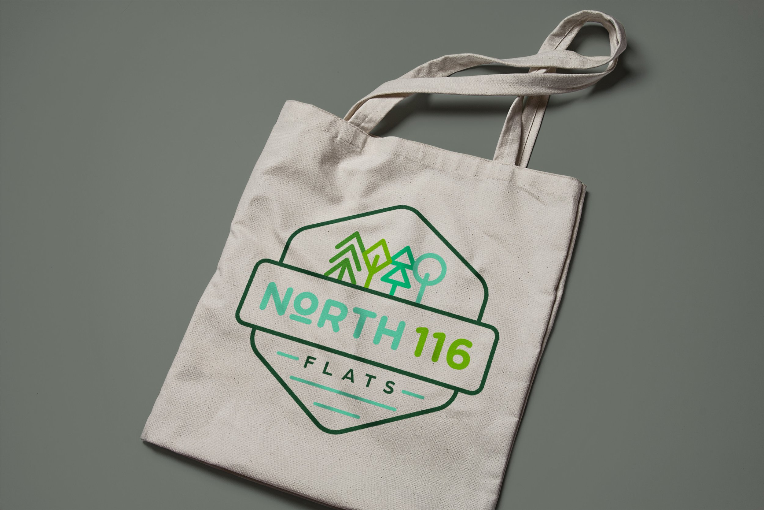
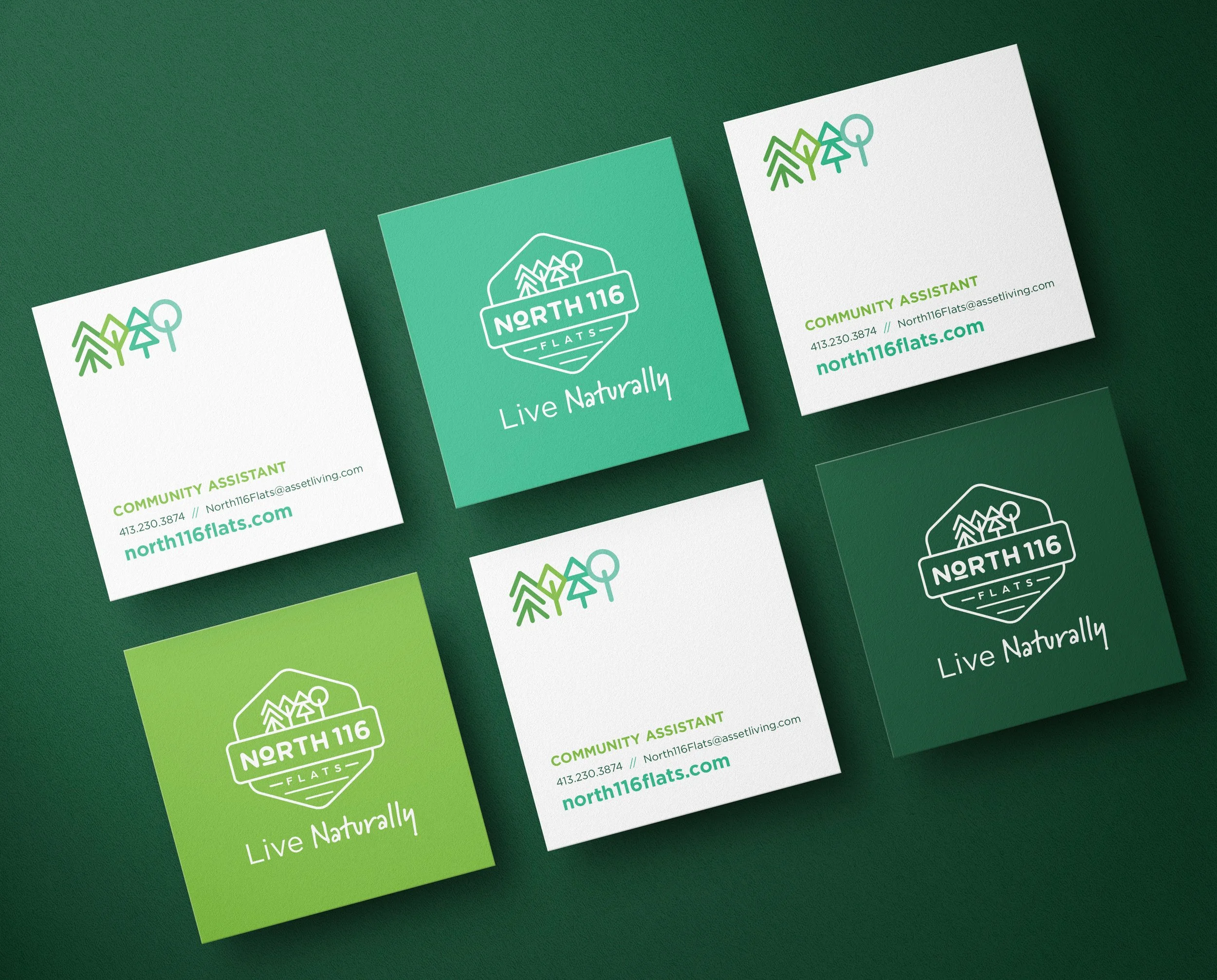
North 116 Flats
Messaging & Copywriting
Brand Identity
UI/UX
Creative Direction
Naming
the challenge
Differentiate a new residential community that was further away from campus than most competitors.
the strategy
Create a brand inspired by the surrounding landscape and everyday connection to nature.
the brand
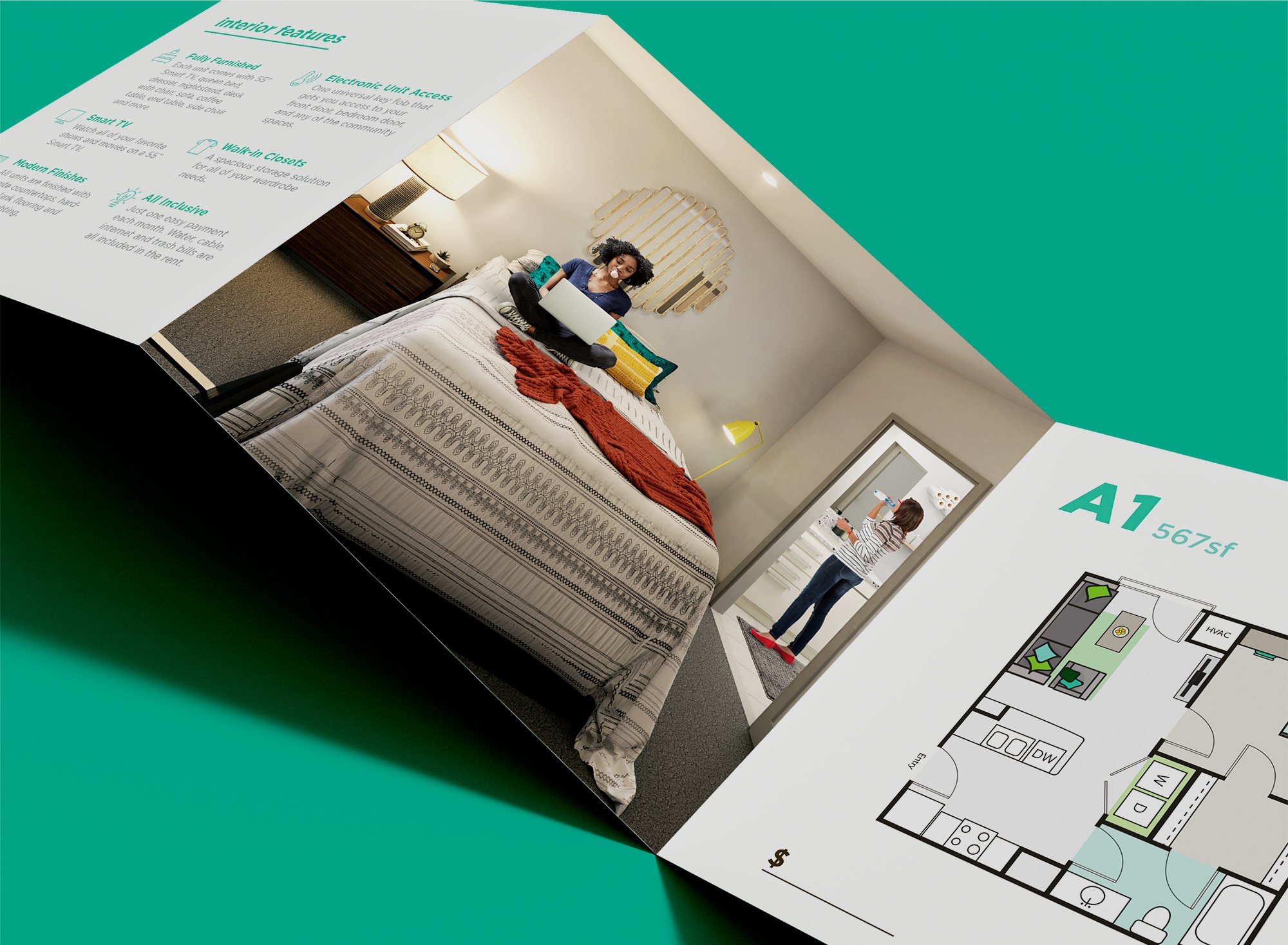
Develop the name, identity, website, and leasing materials.
the experience
Deliver a cohesive brand from first impression through leasing.
The brand identity is deeply intertwined with the remarkable natural environment that surrounds the property. We drew our inspiration from the lush and diverse flora that defines the region, creating a brand that pays homage to the magnificent trees that grace the surroundings.
The logo is a visual tribute to the thriving ecosystem that lives there. It incorporates elements such as white pine, red maple, northern red oak, hemlock, cherry blossoms, and Japanese elm, all of which are prevalent in our area. These elements come together to form a distinctive and memorable logo that reflect the property’s commitment to preserving and celebrating its natural surroundings.