
Treehaus Townhomes
fountain residential
Messaging & Copywriting
Brand Strategy
UI/UX
Branding
Naming
Experience Design
about the community
Treehaus is a next-gen student housing brand shaped by calm design, grounded living, and intentional growth. Built for Clemson students seeking more than just a place to stay, Treehaus offers a softer, smarter take on off-campus life—where wellness is part of the foundation, not just a feature.
-
Create a student housing brand that connects with Gen Z while honoring Clemson’s deep sense of place. The identity needed to feel modern without chasing trends, wellness-forward without sounding performative, and personal without trying too hard.
-
We branded Treehaus as an intentional contrast to the usual student housing experience. From the name and tone to the interior strategy and amenity messaging, everything was designed to feel warm, minimal, and rooted. The visual identity draws from nature and simplicity. The voice is clear, grounded, and quietly confident.
-
Name + Tagline: Treehaus evokes strength, nature, and simplicity. The tagline Rooted in Clemson. Built for you. ties it all back to place and purpose.
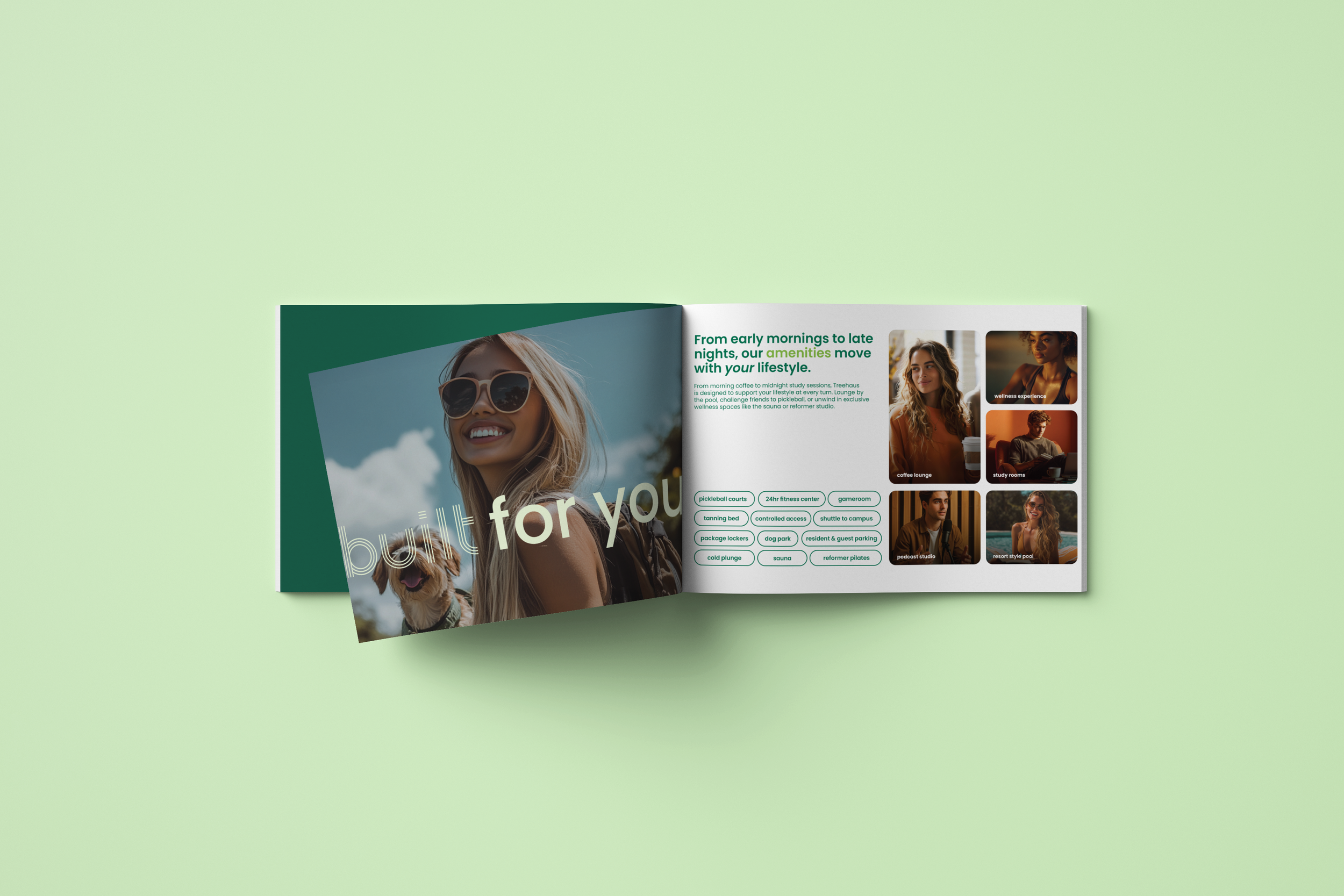
Wellness Strategy: Root + Rise became the sub-brand for a curated amenity experience, including cold plunge, sauna, Pilates, and contrast therapy.
Messaging System: Floorplans and interior copy reflect rhythm, flow, and flexible living—always with a tone of ease and intention.
Website + Signage Copy: Every word was crafted to feel personal and calm. The brand doesn’t overexplain or oversell—it invites.
Tone + Voice: Minimal, modern, and grounded. Treehaus speaks like a friend with good taste, not a brand trying to impress.
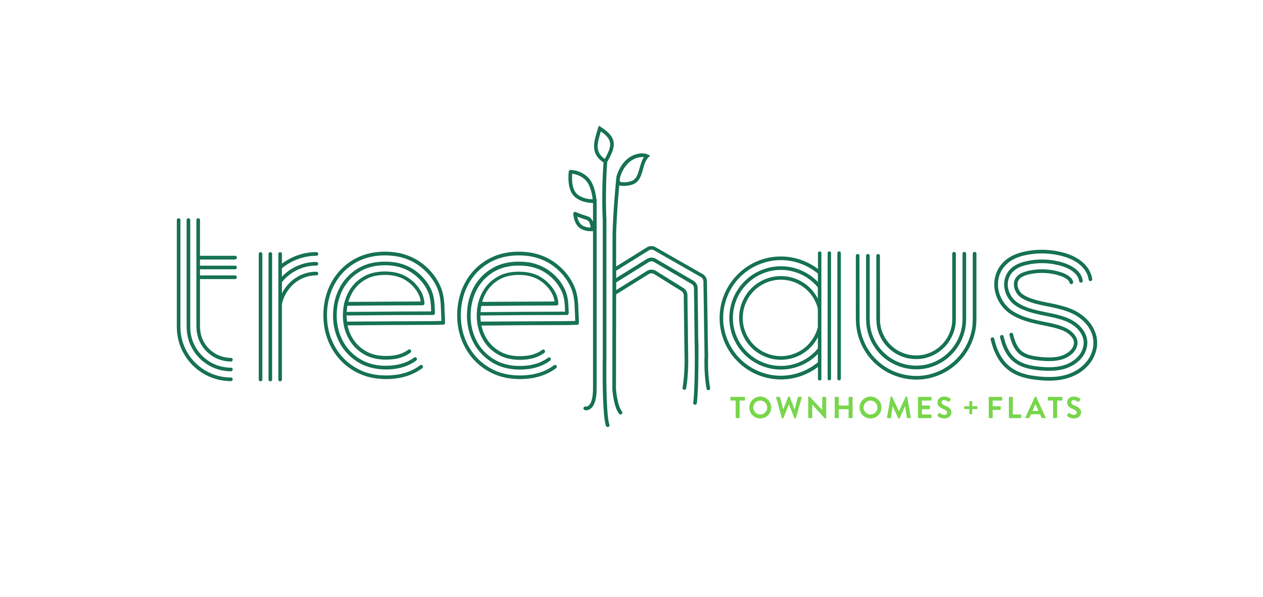
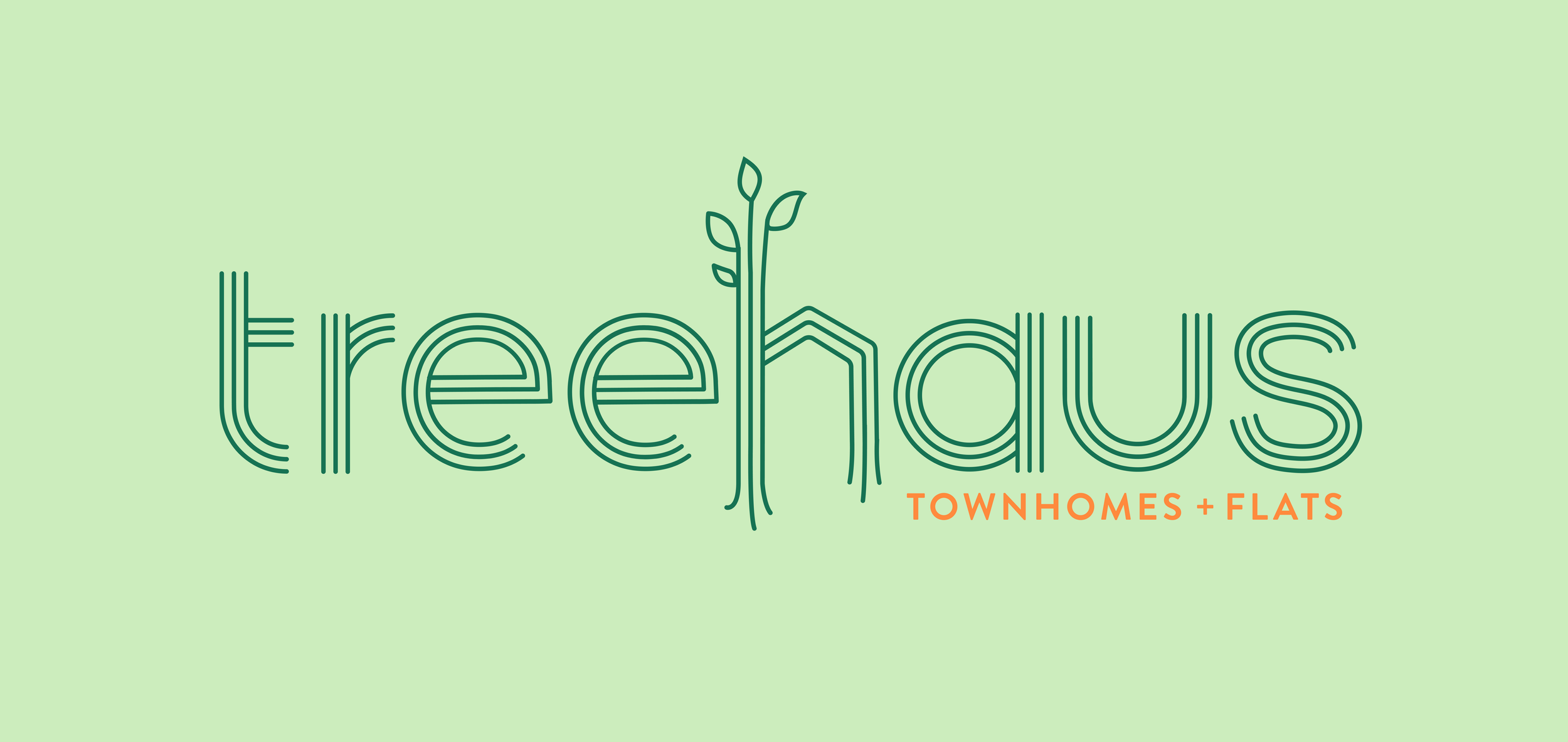
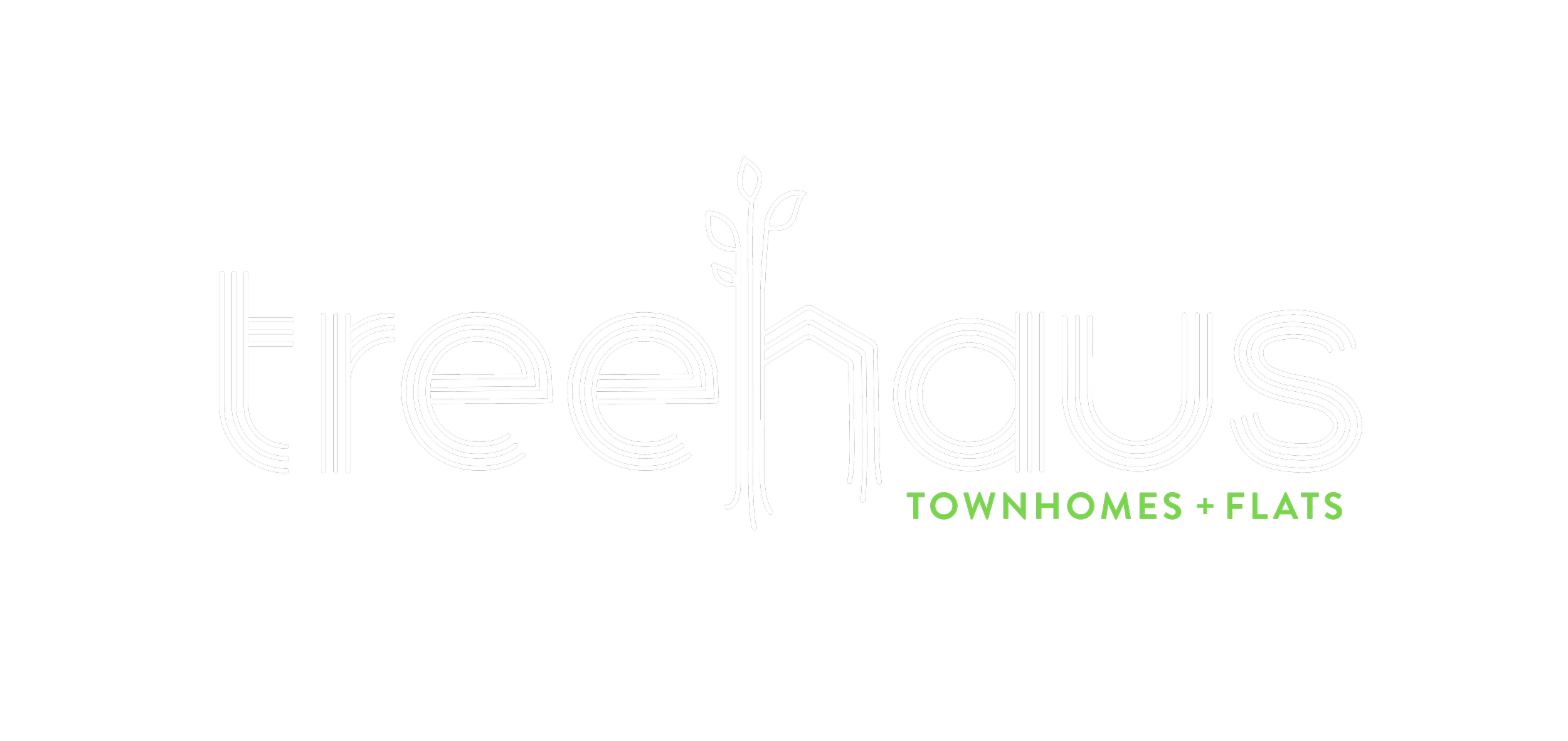
The name Treehaus was inspired by the idea of balance—something rooted and grounded, yet designed for growth. It evokes nature, strength, and simplicity while nodding subtly to modern design.
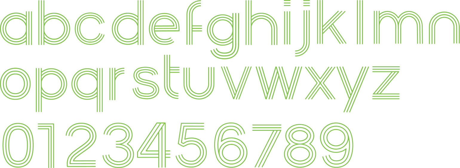
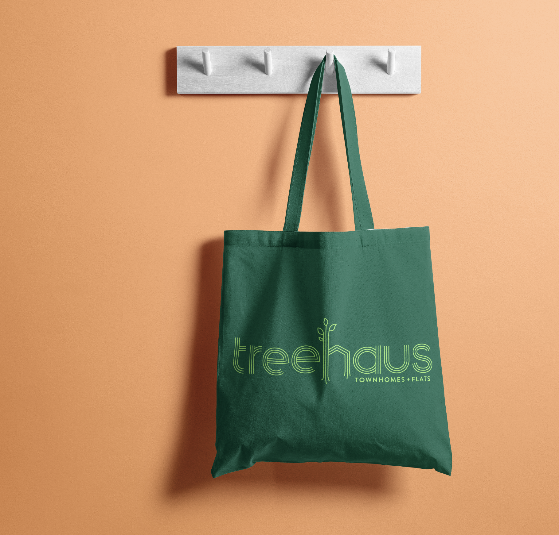
The logo reflects that same balance. We paired clean, architectural typography with soft, organic spacing to create a visual identity that feels both elevated and approachable. The mark is minimal but memorable, designed to live across print, digital, and physical spaces without ever feeling overbuilt.
The overall brand centers on calm confidence. We intentionally avoided loud, hype-driven student housing tropes and built a tone of voice that feels personal, clear, and quietly cool. Every detail—from floorplan names to amenity campaigns—was crafted to reflect intentional living and resonate with the pace of real student life.
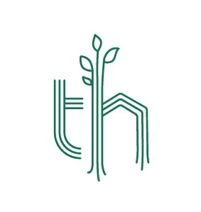
The Treehaus monogram is a symbolic representation of the brand, seamlessly combining the letterforms "t" and "h" into a unique, nature-inspired mark. This monogram embodies the grounded yet elevated essence of Treehaus, featuring clean geometric lines with organic, flowing elements.